The best office spaces are those whose designs encourage creativity, collaboration, and productivity. A comprehensive design must incorporate every aspect of the space, from architecture to furniture and everything in between. Surprisingly, color schemes are often neglected in offices, and that can be a huge mistake. The right combination of colors not only makes your workspace more visually appealing, but it is also scientifically proven to improve productivity and mood. Here are other reasons why your color scheme is important.
The Effects of Color
Your work environment should be one where employees feel at ease, inspired, dedicated, welcomed, and happy. That’s a tall order for any company to fill, but there are ways in which your color scheme can encourage all of those emotions.
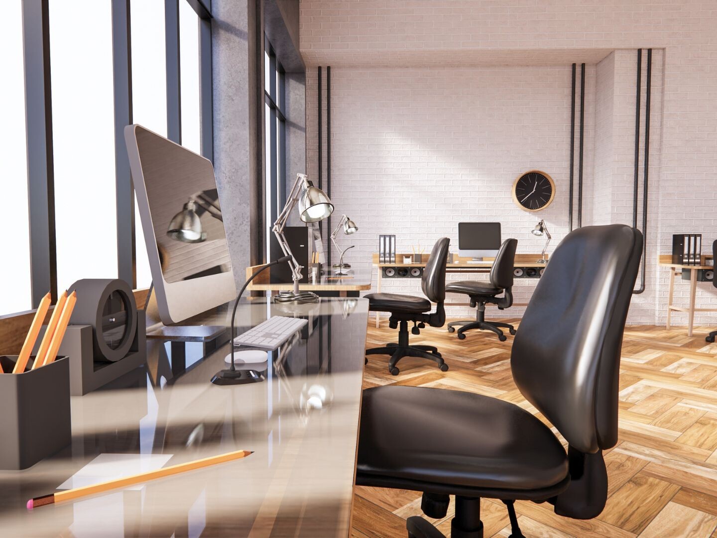
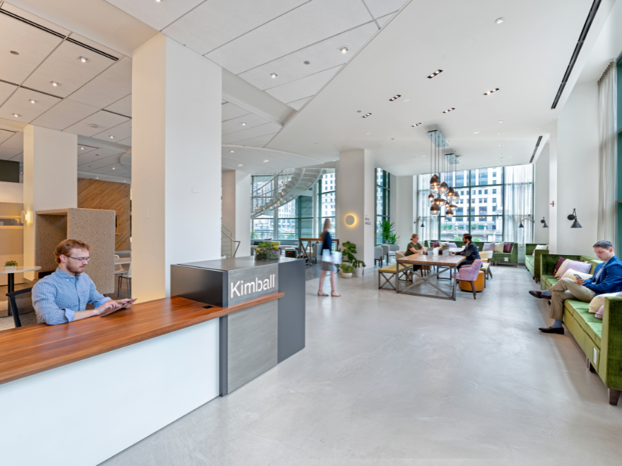
While whitesand grays are trending because of their clean and modern hues, it is a good idea to incorporate many other colors into the office. A purely white office may lead to distraction, so be sure to include plants, artwork, natural light, and accent walls.
Blues and greens are the colors most favored by employees, as both are calming, inspiring, and don’t cause eye fatigue. There are hundreds of shades of green and blue, but the consensus is that the main color in any palate should be a pastel. Once you have a base of light blue or green to work with, consider accents to highlight certain task-focused workspaces.
Accents and their impacts
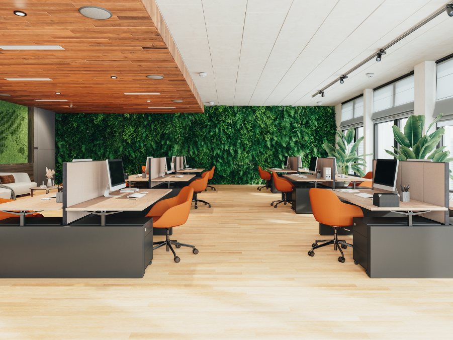
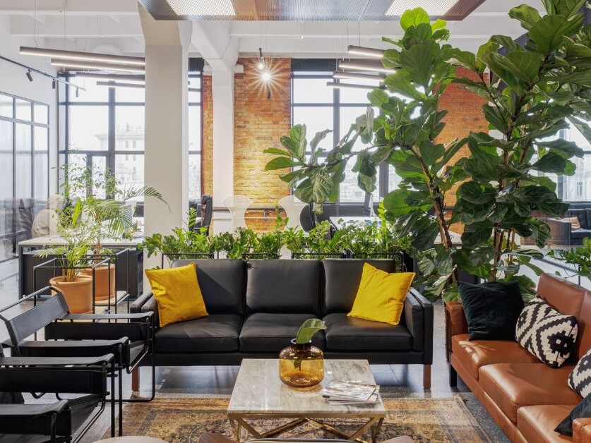
Yellow is the color of optimism, but bright yellow over a large space has been shown to increase anxiety. Consider small pops of yellow in areas where you want to boost people’s moods, as opposed to dedicating whole walls to the color.
Green is the perfect color for innovation. It promotes harmony, like blue, and it has also been shown to increase creative performance. Greens encourage collaboration, so meeting areas with green accents will boost productivity and the quality of work.
When we think of reds, we think of passion, anger, love, and energy. However, red is a great motivating color for those with a keen attention to detail. It stimulates the pulse and raises energy levels, though it should be used sparingly. The color can be intimidating, so use it in areas where you want energy levels high and employees focused, as opposed to an entire room.
Colors to avoid
Aesthetically, there isn’t anything wrong with purples, oranges, turquoises, or pinks. There are shades in each of these colors that may work well; generally speaking, however, they tend to decrease productivity. While purple puts people at ease, it is also associated with romantic feelings. Vibrant colors like pinks and turquoises may be too distracting; your color scheme should encourage creativity, not draw someone’s attention away from their work.
In broad terms, your workplace color scheme should include cooler, softer colors with energized accents; by incorporating more than one color, you will add interest to the space and improve people’s moods. But color is just one aspect of making your workplace a well-rounded environment. Environments Denver is here to create a workplace design that meets the needs of your company and employees. We take care of the aesthetic side of your business so you can focus on growing your company. Contact us now to learn how we can use design to help your business succeed.