If you’re in the midst of a new restaurant design or planning to give your restaurant an upgrade, color is an element that shouldn’t be ignored. The color palette you choose will have a significant impact on the ambiance and mood, so it may be helpful to consult interior design firms before making your final decision. Interested in learning more about why color is so important in restaurant design? Here, we discuss the influence that different hues will have on patrons.
The Psychology of Color in Restaurant Design
Color plays an important role in creating first impressions and is crucial in affecting guests’ moods. Top brands recognize that the right color scheme is paramount and can even be used to increase sales. When you begin the process of restaurant design or a rebrand, consider the environment that you’re aiming to develop. Studies have shown that red hues are effective at stimulating excitement and energy, while blue can suppress the appetite. Although blue is the most commonly used corporate color and can be calming, you’ll notice that few restaurants incorporate blue into their color scheme. This doesn’t mean that blue has to be off-limits entirely; it’s all about finding the best fit for your business. Similarly, yellow and purple are unconventional colors that can make a splash in your restaurant when used appropriately. Yellow may inspire feelings of happiness in restaurant-goers, while shades of purple are regarded as regal or mysterious.
Current Restaurant Design Trends
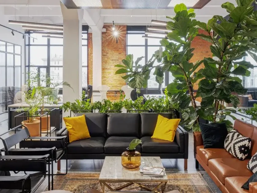
Even if you plan to break from tradition, it may be helpful to utilize a few elements of current trends in your restaurant. Light color schemes are incredibly popular right now, as light hues create an inviting and sleek ambiance. Colors such as ivory and grey are widely used in a variety of settings, from charming bistros to upscale restaurants. It probably comes as no surprise that health-focused restaurants often opt for the color green (often incorporated with natural materials, such as wood). Earth tones are a mainstay in restaurants since this color palette is closely associated with nature and can foster feelings of relaxation. Earthy shades of beige, brown, and terracotta orange are commonly seen in restaurants because they’re very inviting and aesthetically pleasing. Thinking beyond paint color? You can use textiles to add depth and complement the space. Metal tabletops or live edge wood seating in the waiting areas are simple ways to incorporate natural hues.
When planning restaurant design, color is one of the most important components to consider. Whether you already have a vision for the space or you’d like professional guidance in identifying one, we’re here to help bring your ideas to life. When searching for interior design firms, be sure to consider the breadth of expertise. Our team is well-versed in designing for a plethora of commercial industries, including restaurants. Interested in learning more about our process? Contact us today for a consultation.